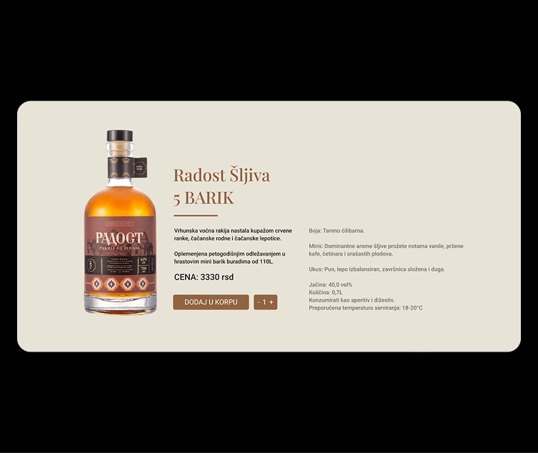
Radost Brandy
(INDUSTRY)Spirits
(PROJECT SCOPE)Visual Identity, Packaging, Website
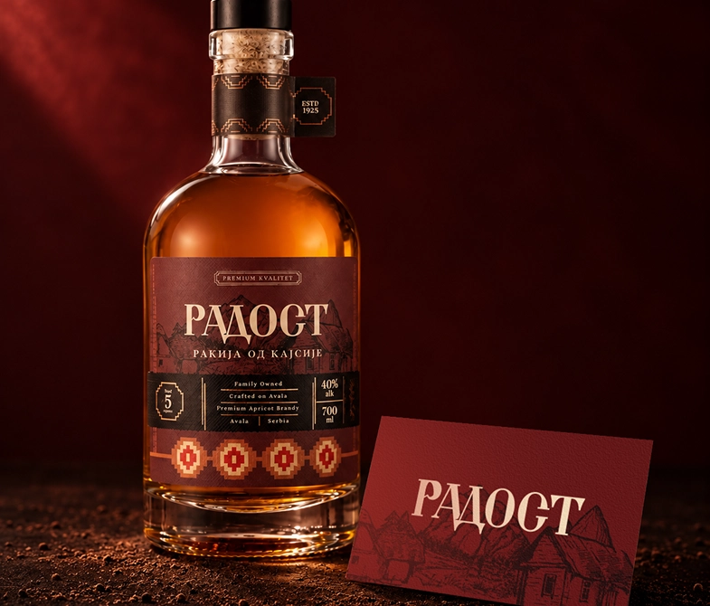
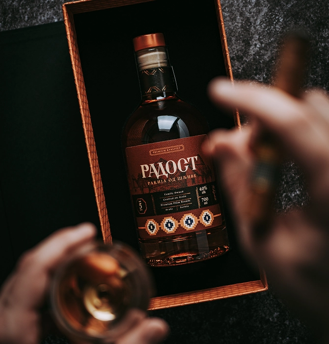
Radost means “happiness” in Serbian. For this rakija brand, we found that happiness in nostalgia: familiar places, shared moments and memories that grow warmer with time. That idea guided an identity rooted in the village where its story began.
(CHALLENGE)
The name invited an obvious visual direction: bright colours and cheerful symbols. Radost needed a more mature interpretation, one that suited a spirits brand and reflected its heritage. The challenge was to express happiness through a sense of time and place, while establishing a distinctive presence in a category full of black and gold.
(SOLUTION)
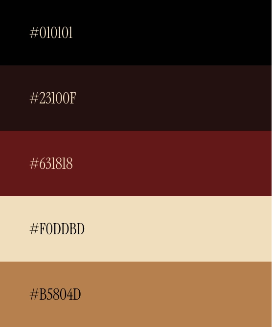
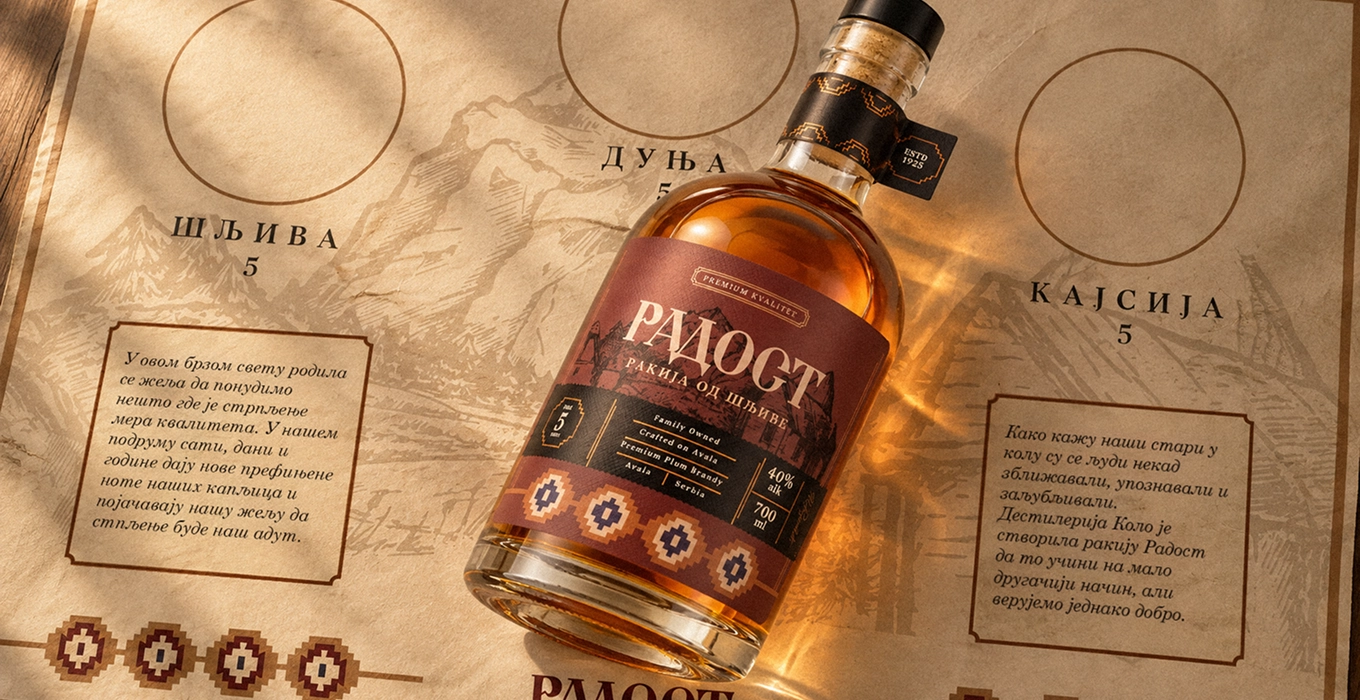
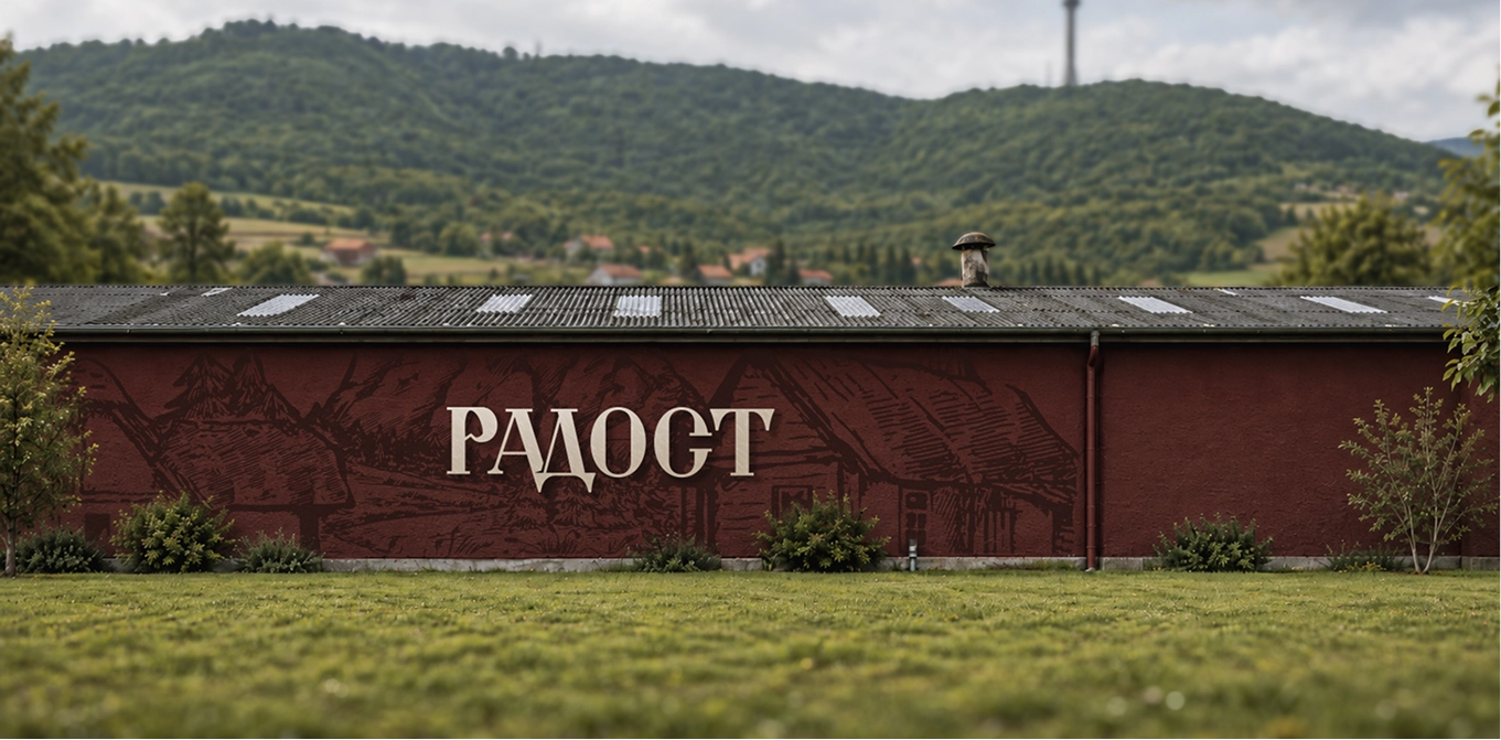
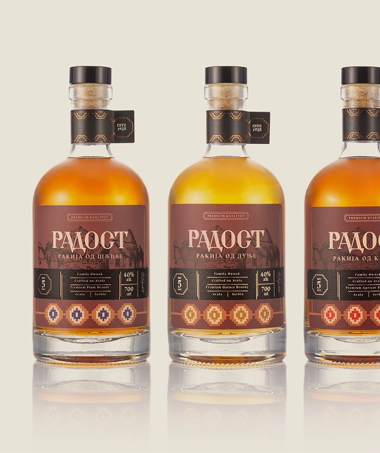
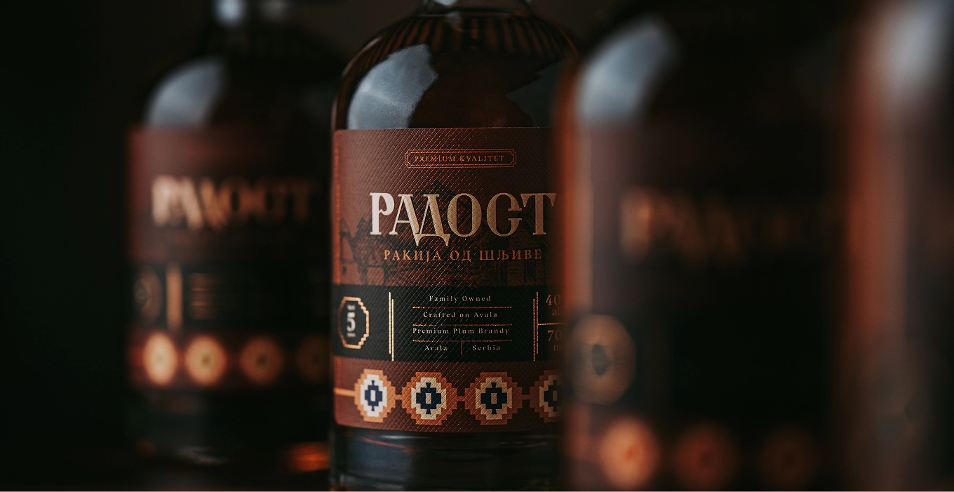
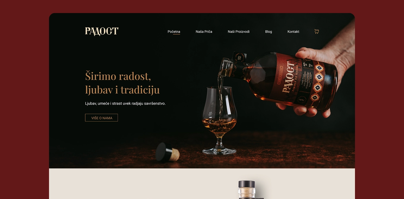
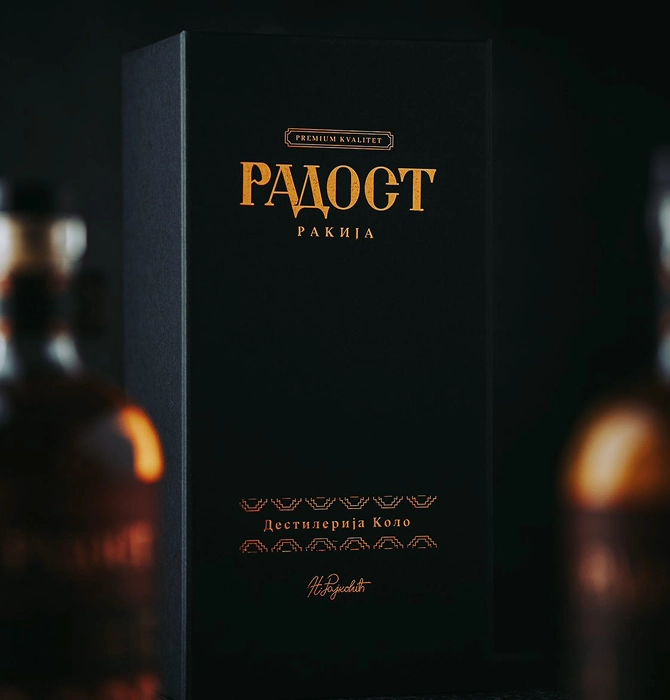
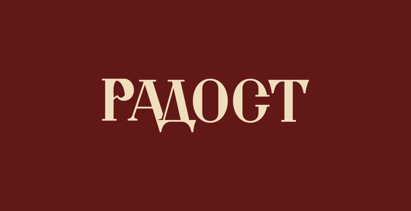
We drew on the affection people hold for earlier times, giving Radost a vintage character with an emotional connection to its name. Traditional typography, crosshatched illustration and Serbian folk symbols brought that idea to life. Deep burgundy with brown undertones gave the packaging a recognisable colour, distinct from the blue tones of its closest competition. From the logo and full packaging range to the website and exhibition materials, every element carries the same sense of warmth and familiarity.