Potpis XO.
(INDUSTRY)Spirits
(PROJECT SCOPE)Logo Design, Packaging
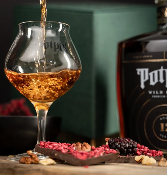
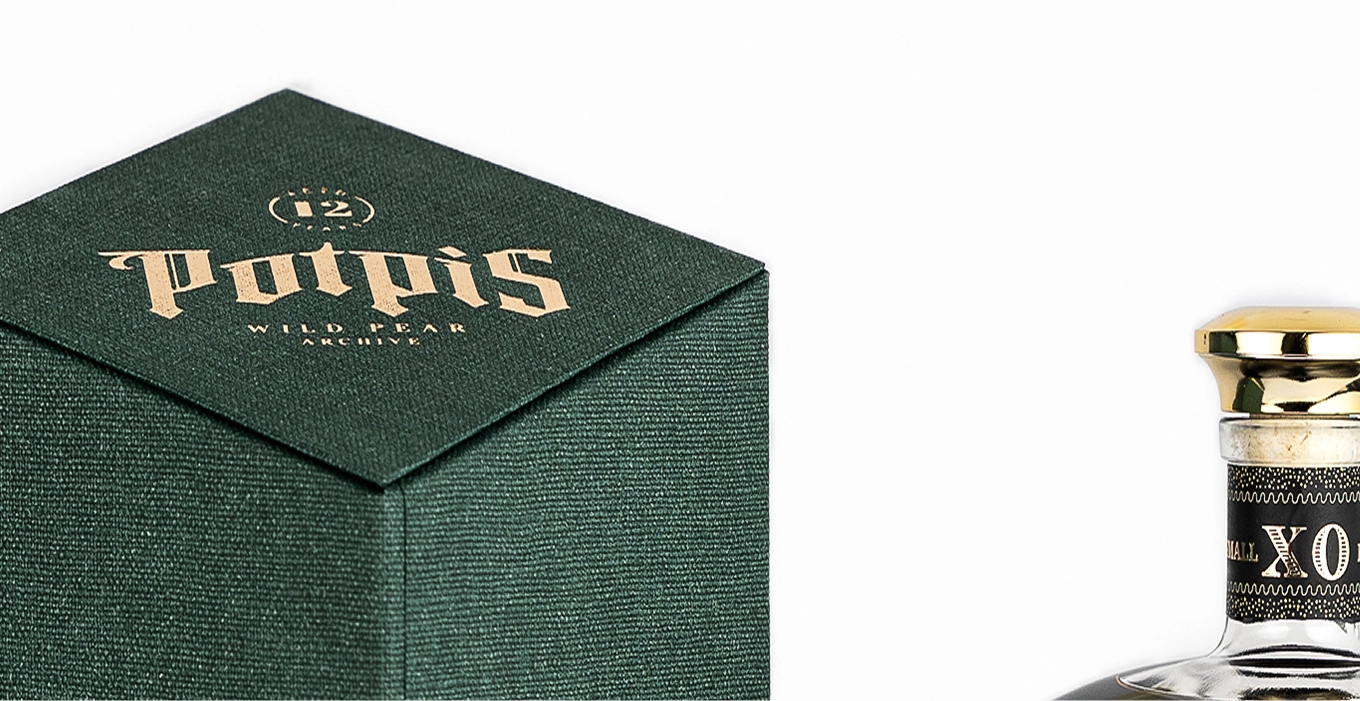
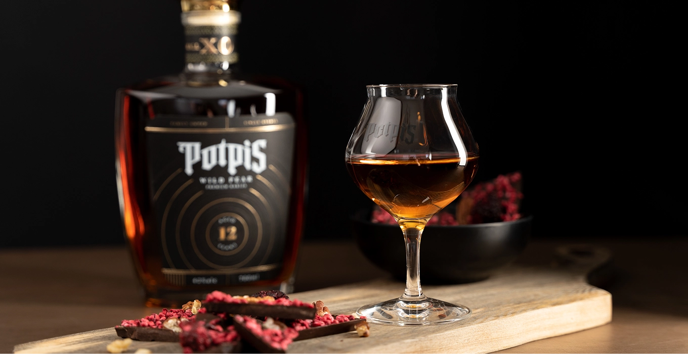
Potpis XO is a luxury rakija shaped by twelve years of ageing. We created a dedicated logo and packaging that tell its story through a simple idea: time leaves its signature.

(CHALLENGE)
XO needed to occupy a clear place at the top of the Potpis range. With colour defining the wider collection, the challenge was to create a distinct expression of luxury that communicated its higher price and twelve years of maturation while remaining part of the same brand.
(SOLUTION)
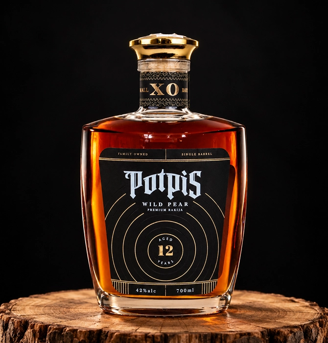
We deliberately chose black and gold to set XO apart from the colourful Potpis collection, establishing a clear distinction between the core range and its luxury edition. The design takes inspiration from tree rings, a natural record of age, reimagined as a signature of time—a connection to the Potpis name, meaning “signature.” Black and gold rings add texture and guide the eye towards the 12-year age statement.