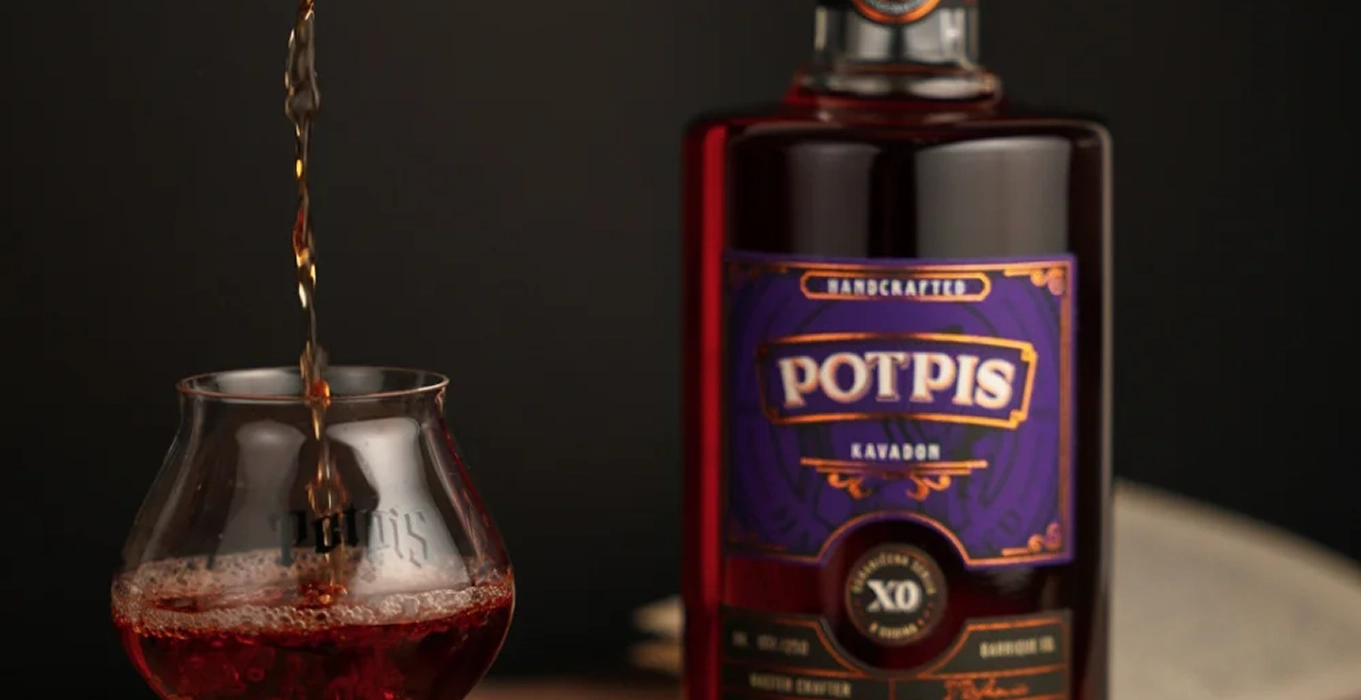
Potpis Barrique Ed.
(INDUSTRY)Spirits
(PROJECT SCOPE)Packaging
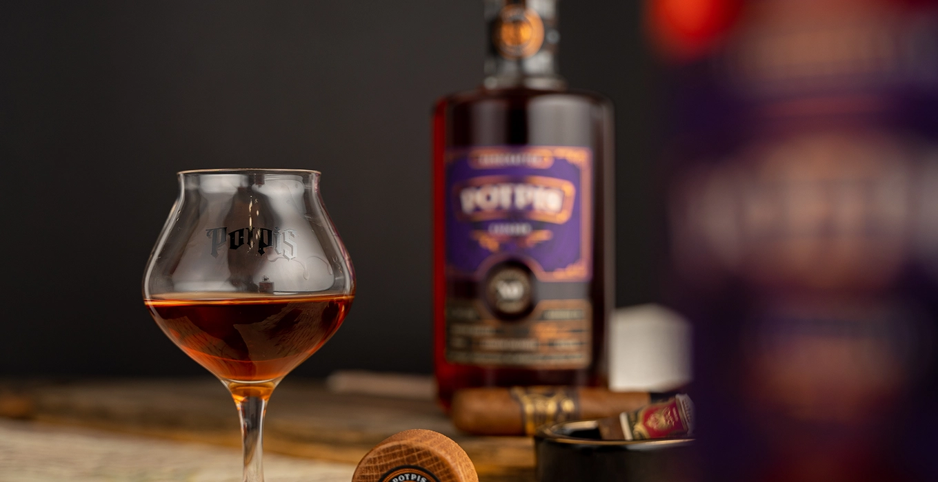
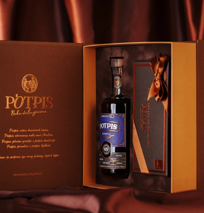
Potpis is a Serbian rakija brand rooted in family tradition, patience and respect for the orchard. Its name means “signature”—a fitting expression of the care behind every bottle. We translated that story into a visual identity, packaging and exhibition materials.
(CHALLENGE)
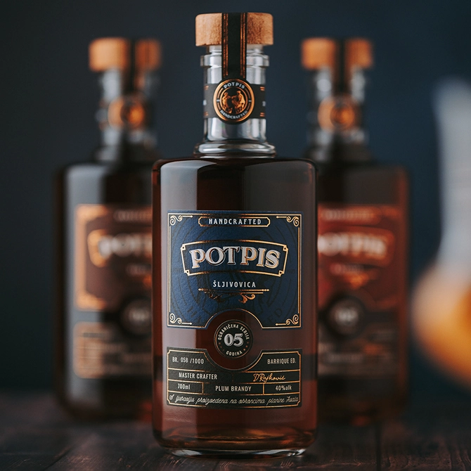
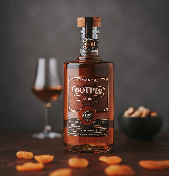
The packaging needed to signal something special while staying connected to Potpis and its tradition of quality. Our challenge was to introduce colour with confidence, balancing shelf appeal with the refinement expected of a premium brandy.
(SOLUTION)
We paired a distinctive colour palette with classic design details, creating a label that feels expressive and considered. The balance gives Potpis Barrique a recognisable presence without losing its elegance. The edition is now stocked in more than 40 retail locations, including some of Serbia’s biggest retail names and airport duty-free shop.